
Brand Design for
Ohria Ayurveda
About the project
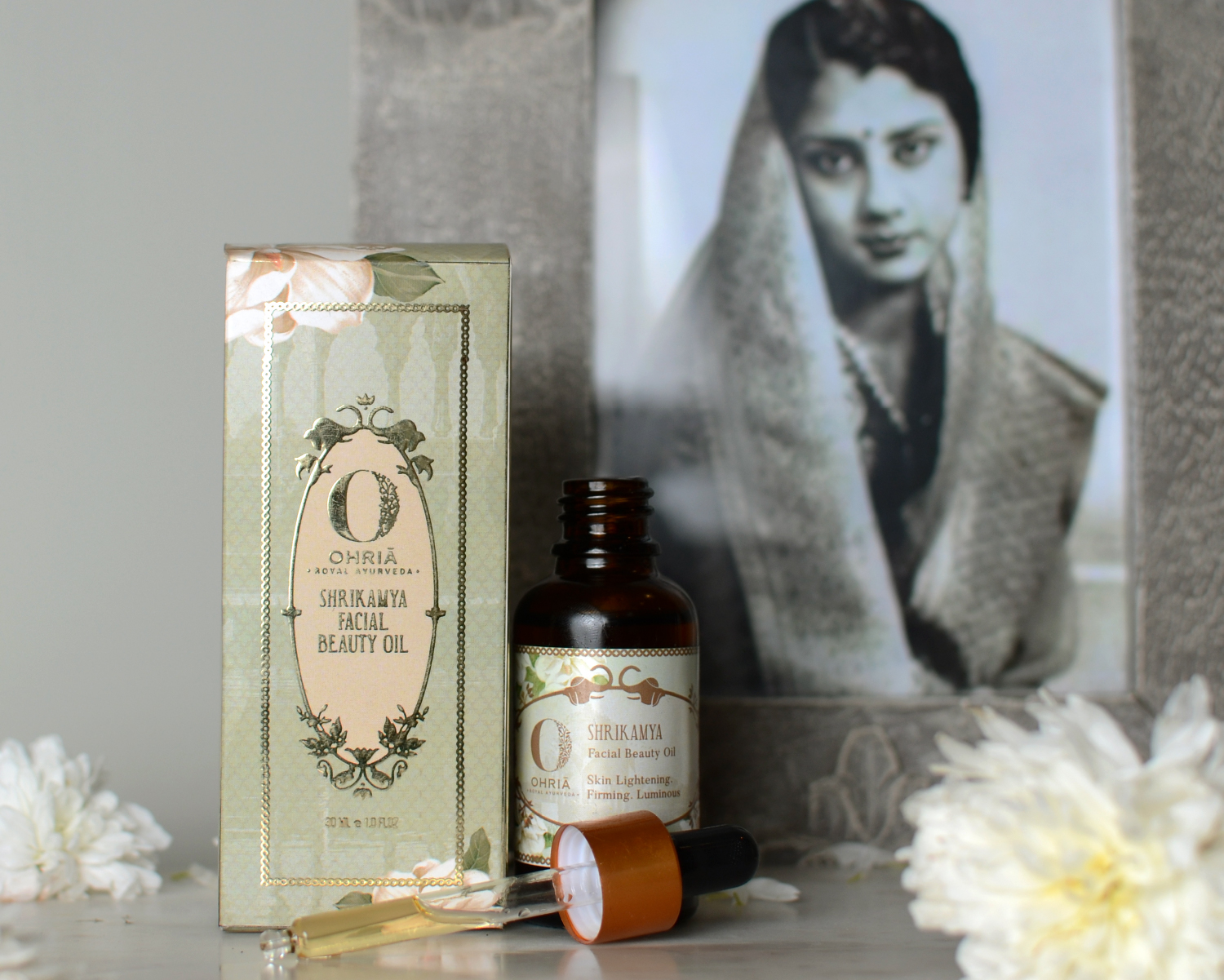
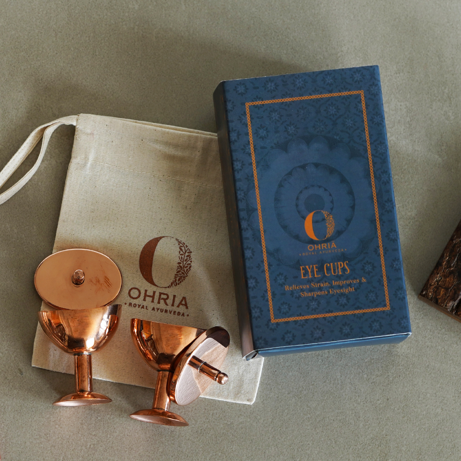
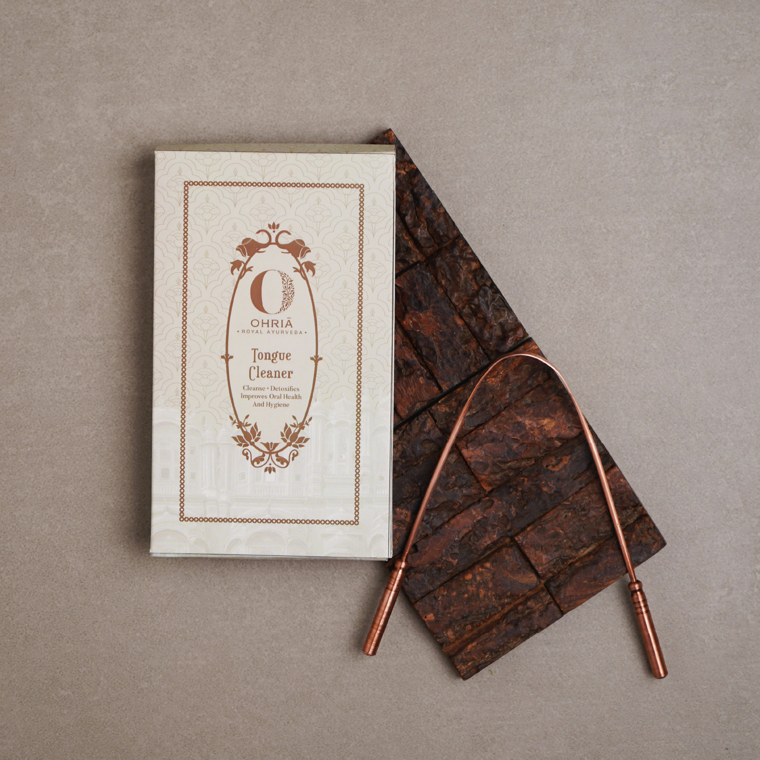
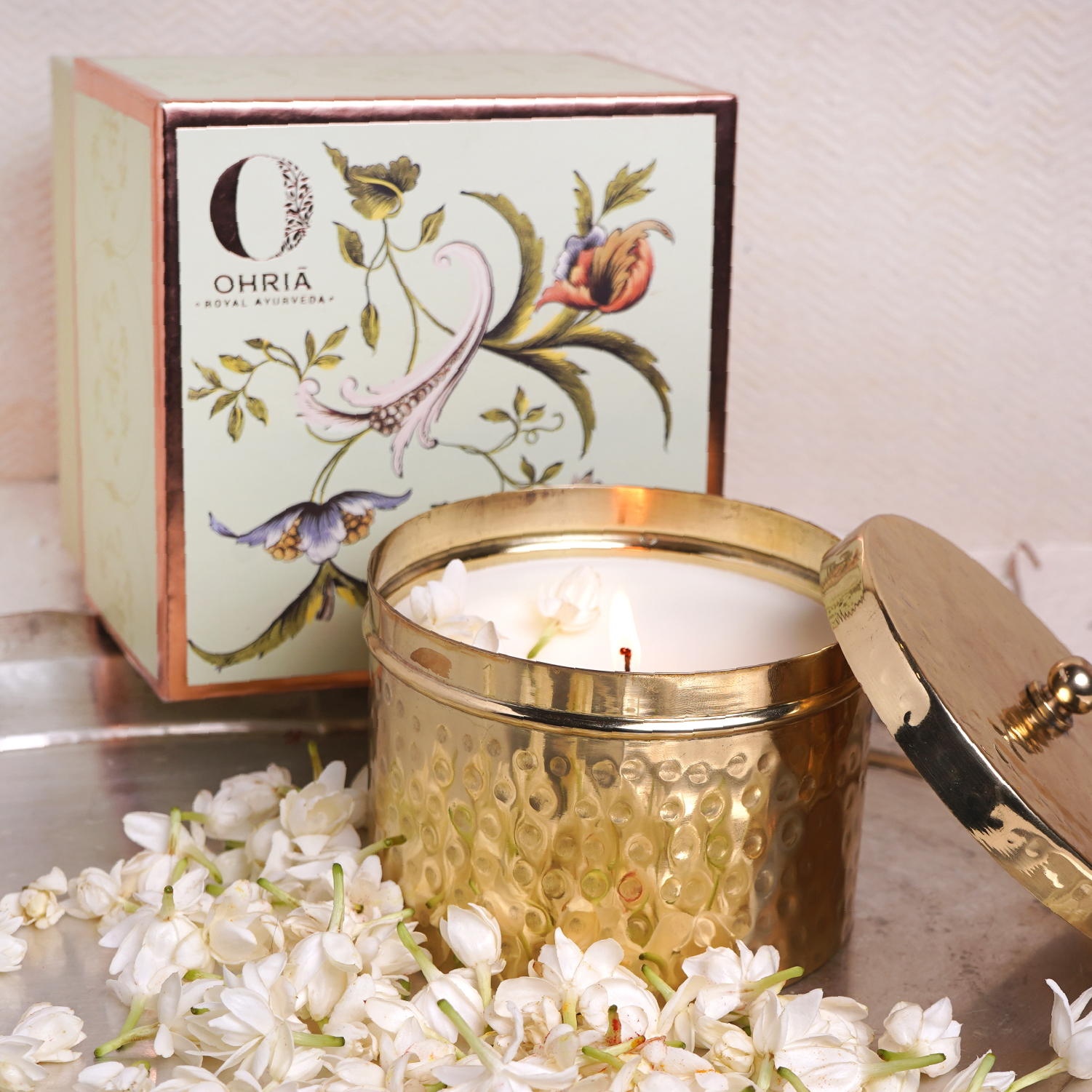
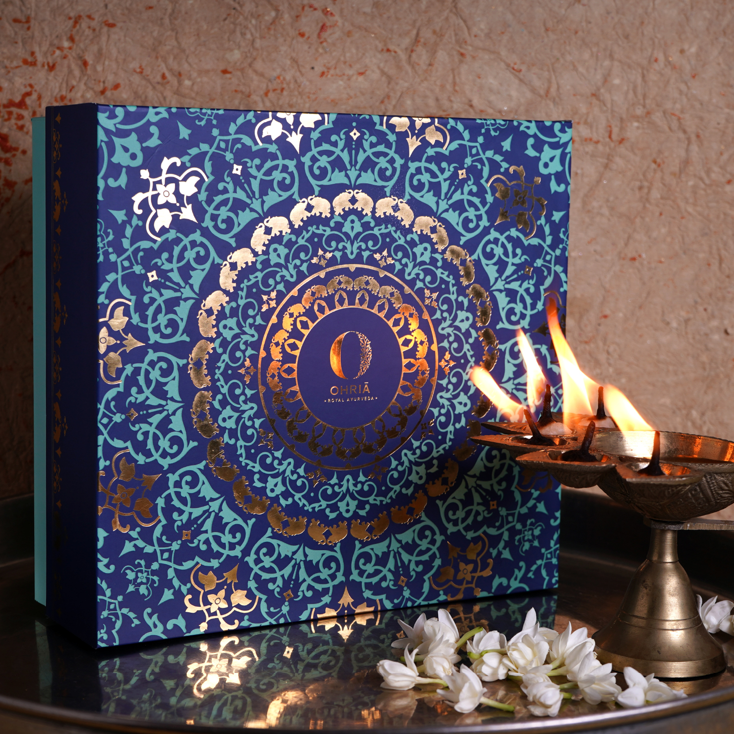
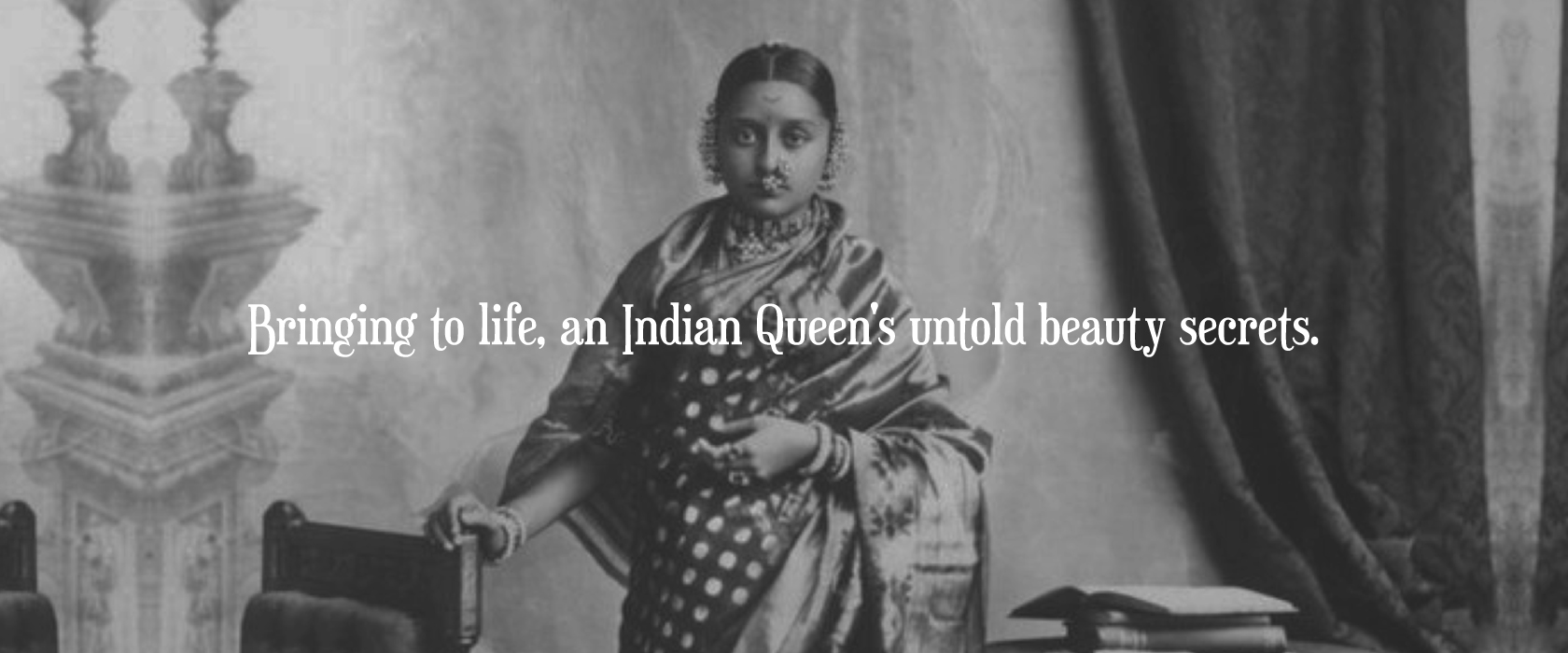
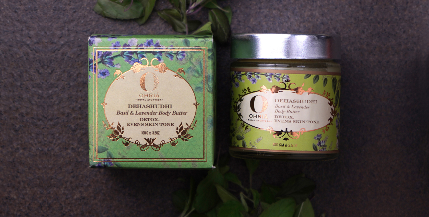
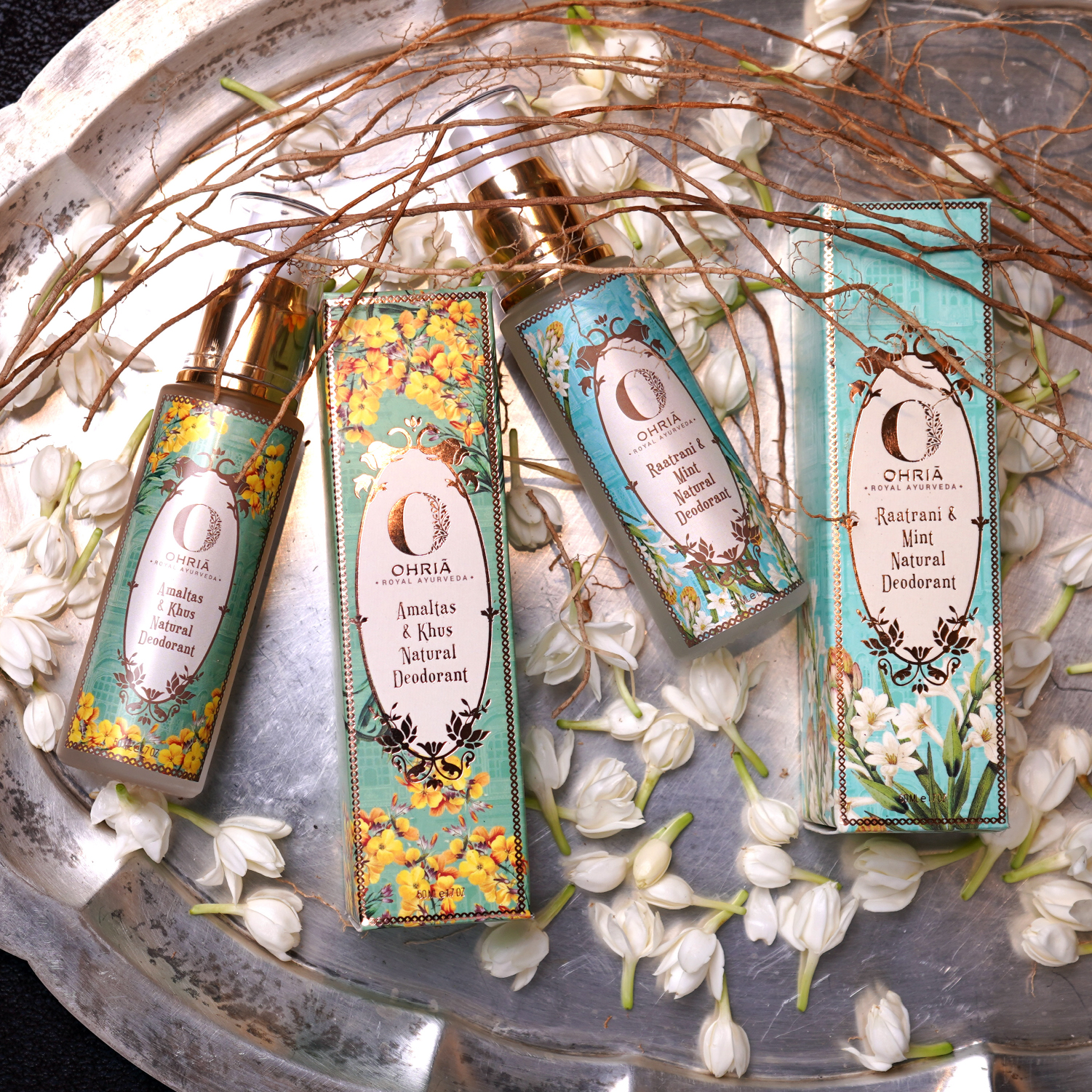
Ohria is a beauty enhancing, skin care brand with powerful Ayurvedic ancient formulations. Ohria manifests a 6000 year old tradition of ayurveda through 100% natural products which are adaptations of an Indian queen’s untold beauty secrets.
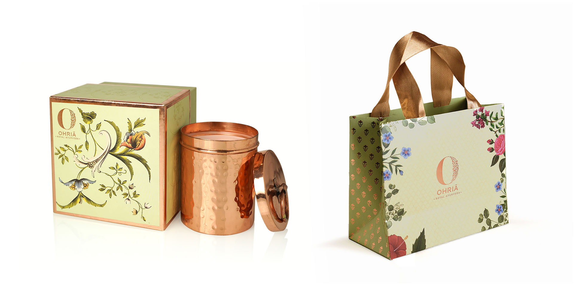
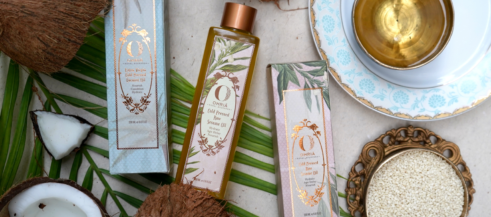
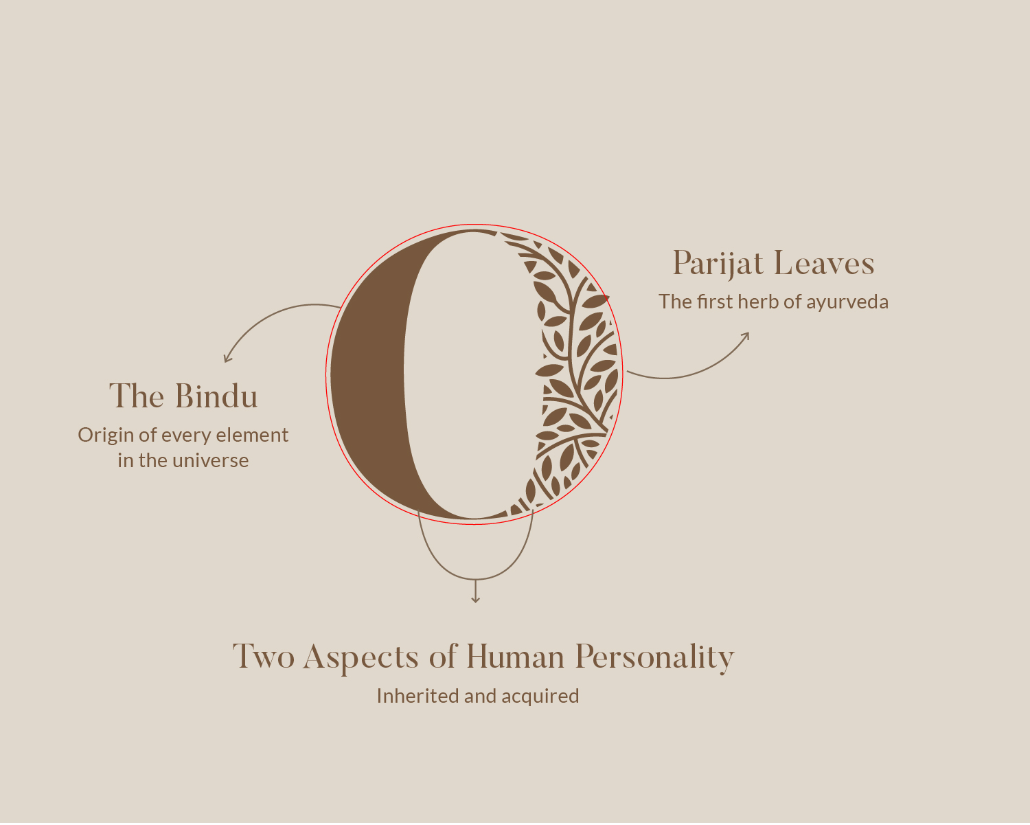
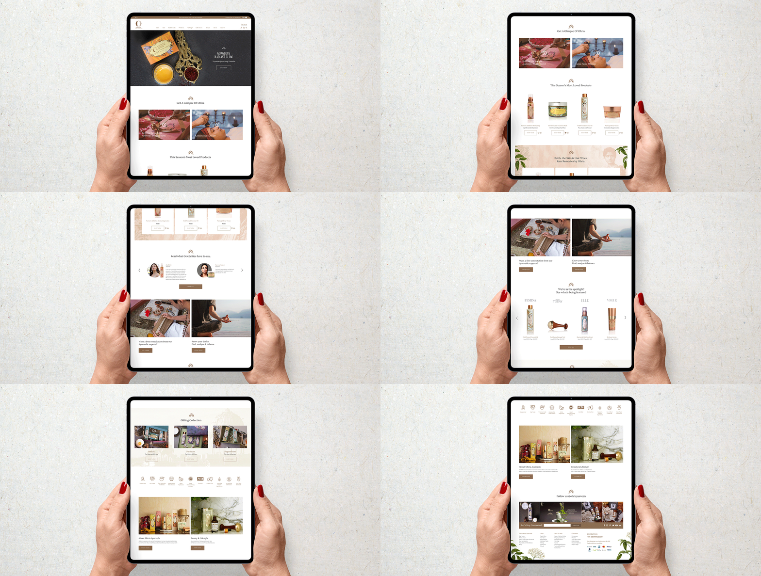
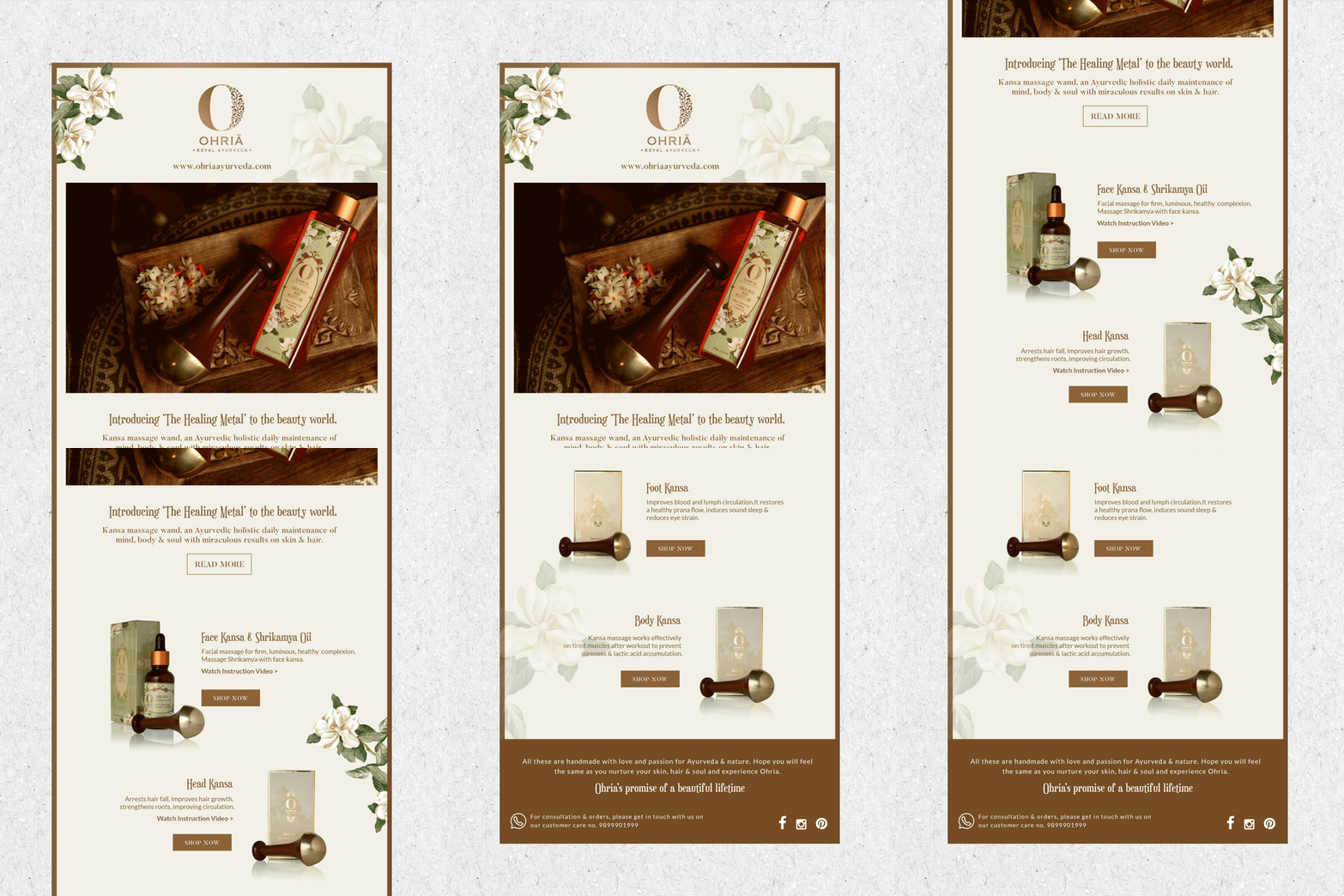
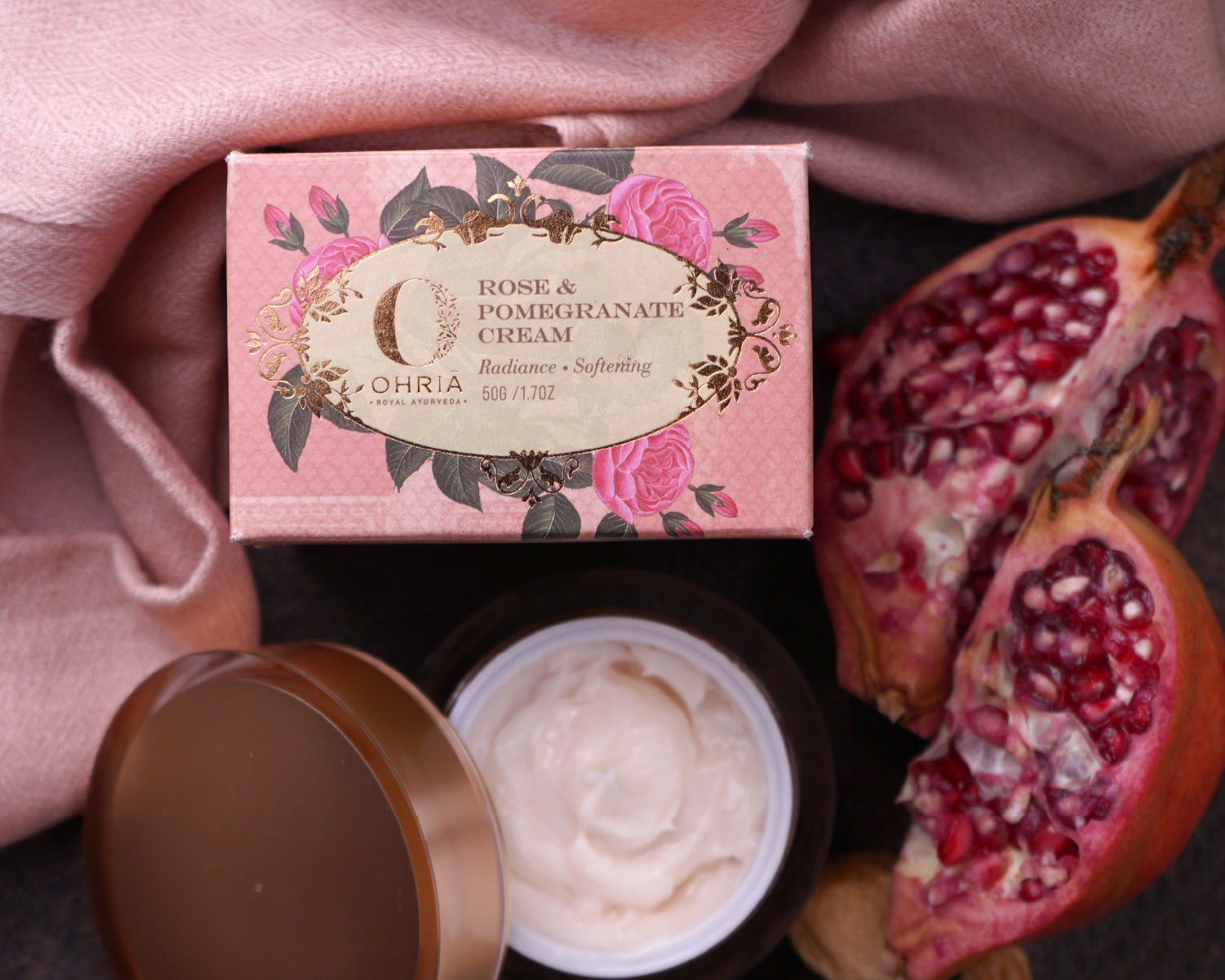
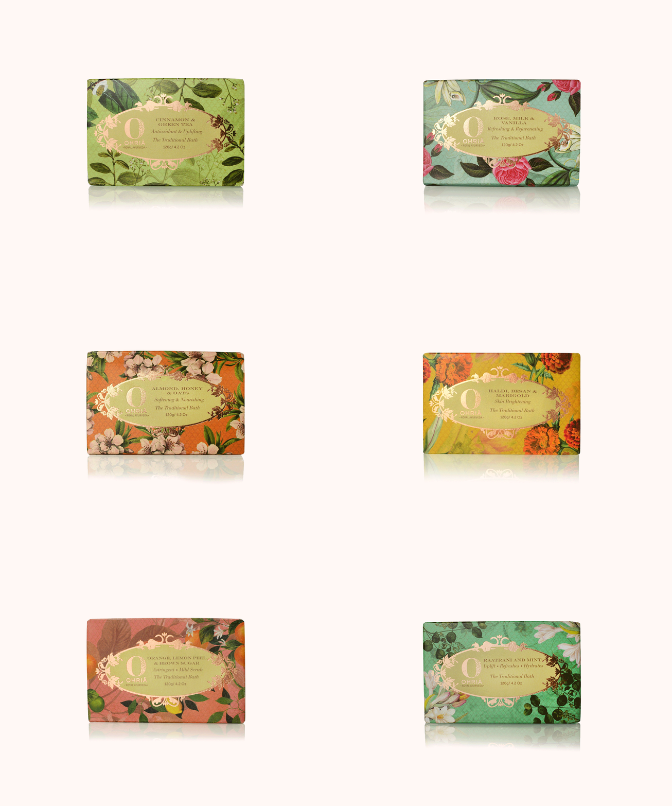
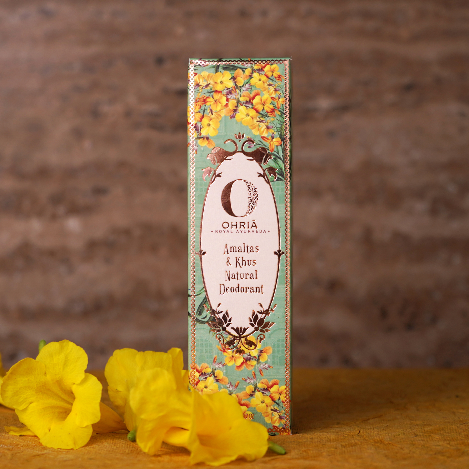
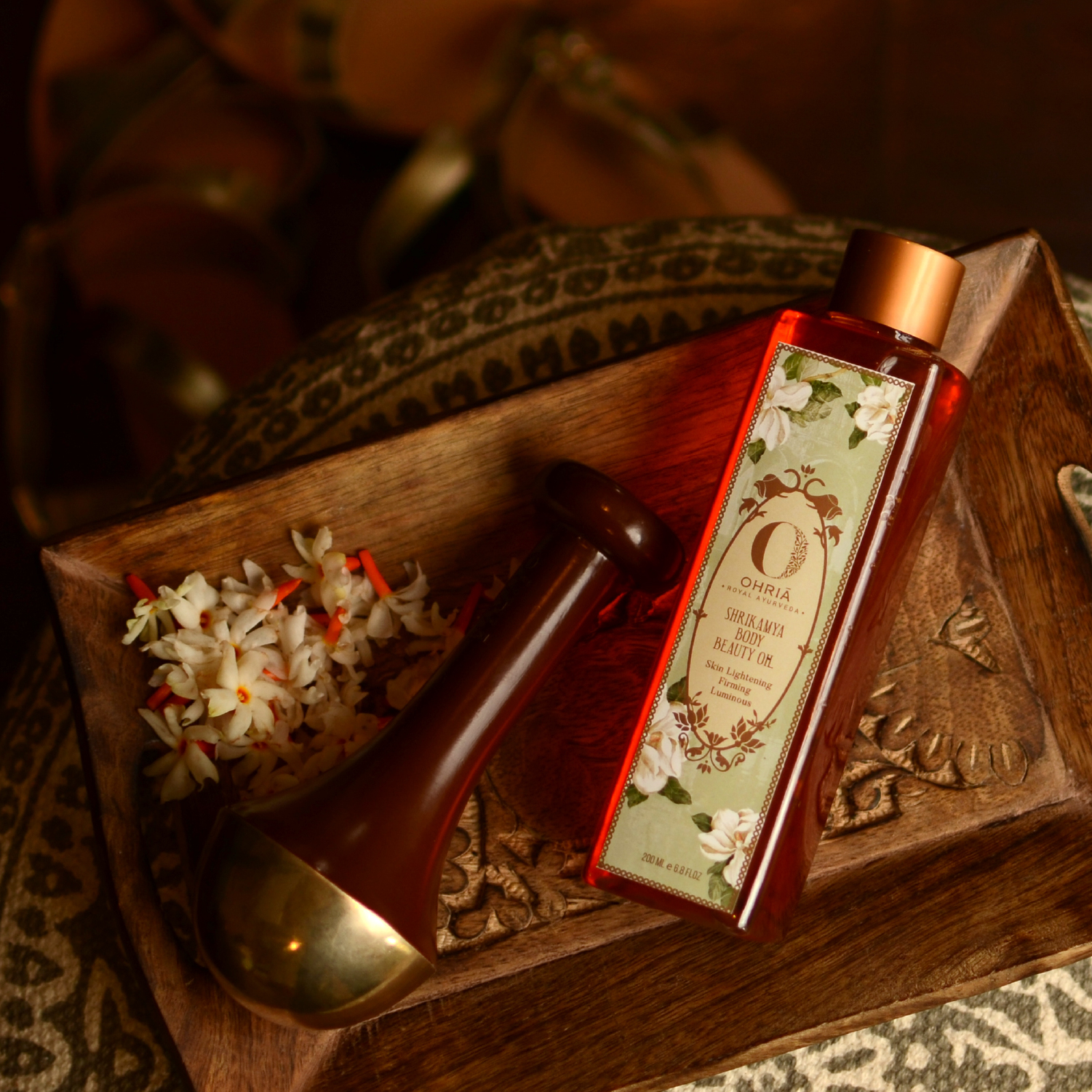
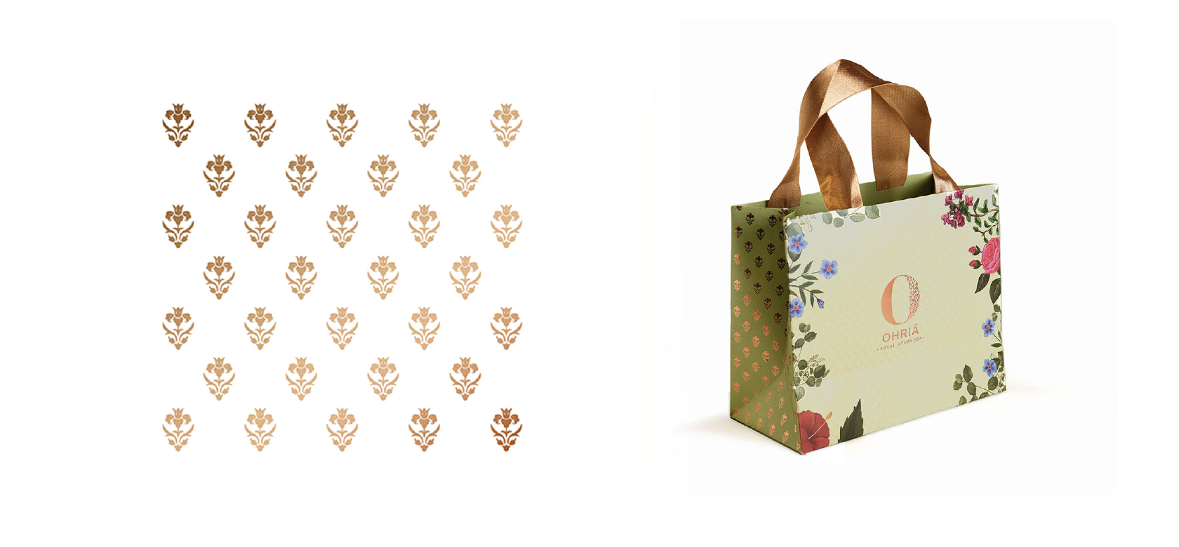
We applied a combination of rich indian hues with ornate and traditional looking typefaces to create a soothing, luxurious, premium, and natural experience for the consumer. We blended floral motifs influenced by Rajput architecture and ancient royal Ayurveda to differentiate the brand. The O portrays the duality of the human personality – inherited and acquired, a perfect balance between the two results in eternal beauty. The symbol is constructed by the leaves of the Parijat tree, the first herb of Ayurveda. The O is placed as a “bindu”, the origin of every element in this universe.
Challenge
